New York, NY (Top40 Charts) Your album cover is the first impression, the visual introduction to what the listener is about to experience. However, in the pursuit of creating a memorable album cover, many bands inadvertently fall into the trap of overused trends and clichés. Here's a guide to some of the most overused album cover designs in rock music that bands should avoid when using the
Spotify album cover maker by Vista Create to make their own.
1. The Jack Daniel's Label
Emblazoned across countless rock albums, Jack Daniel's label design has become synonymous with a certain rebellious spirit of rock n' roll culture. It's easy to see why it's so appealing - it's instantly recognizable, bold, and carries with it a certain edginess. However, its widespread use has made it a cliché.
Rather than standing out, it blends in with countless others. While it may seem like a cool homage to the spirit of rock and roll, it lacks originality and doesn't say much about the band's unique identity. It's important for bands to remember that their album cover should be an extension of their own brand and not someone else's.
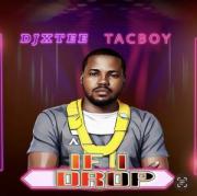
2. The Band Portrait
The band portrait is a classic choice for album covers. It puts the musicians front and center, giving fans a chance to connect faces with the music. However, this design can quickly become repetitive and uninteresting if it's not done right. A simple group shot against a nondescript background doesn't offer anything fresh or exciting to the viewer.
If you're going for a band portrait, try to make it innovative and reflective of your music. Consider your band's persona and how you can visually represent that. Maybe it's through your choice of clothing, setting, or even the expressions on your faces.
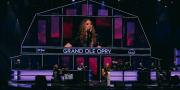
3. Iconic Landmarks
From the Eiffel Tower to the Statue of Liberty, using famous landmarks as part of the design can feel like a cheap way to evoke certain emotions or signify grandiosity. It's an easy shortcut to making an album cover look 'important'.
Unless there's a meaningful connection between the band's music and the landmark, it's best to steer clear of this overused trend. Your album cover should tell your story, not rely on the fame of existing monuments.
4. Comic Book Style Art
Comic book-style art has a vibrant, engaging quality that can be visually striking. It's bold, colorful, and has a certain pop culture appeal. However, it's become somewhat of a cliché, especially in rock music album covers.
If you're thinking about using this style, make sure it genuinely fits your aesthetic and isn't just a random choice. It's crucial to remember that your album cover should be a reflection of your music and not just a trendy design.
5. Overly Dark and Mysterious Imagery
Dark and mysterious imagery is a common trope in rock music. It's meant to convey depth, seriousness, and often, a sense of rebellion. But it can often come off as trying too hard or being inauthentic.
Not every rock band needs to portray a dark, brooding image. Authenticity is key, and your album cover should reflect your music's true essence. If your music is more uplifting or mellow, there is no need to conform to the dark stereotype.
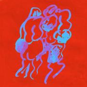
6. Random Abstract Art
Abstract art can be a powerful tool when used correctly. It allows for multiple interpretations and can create a sense of intrigue.
However, slapping a random abstract image on the cover without any connection to the music can feel lazy and disjointed. The cover art should have a clear connection to the album's theme or the band's overall message. It's an opportunity to give listeners a visual representation of what they're about to hear.
Wrapping Up
In conclusion, while these trends have become staples in rock music album covers, they've been overused to the point of becoming clichés. When designing an album cover, bands should strive for originality and authenticity.
The best album covers are those that manage to capture the band's unique sound and personality, offering fans a visual taste of what they can expect from the music. As a band, think of your album cover as another opportunity to express your creativity, connect with listeners, and set yourself apart in the crowded landscape of rock music.